Our drawing canvas is coming along quite nicely! From drawing basic shapes, to text and freeform lines, to deleting objects, our canvas is getting more and more useful features.
Today, we add another set: allowing the user to select line color, fill color, line style, and line thickness. We'll even implement our own custom selector class to do this. Let's go!
The Sample Project
The sample project for this post and all posts in this series is over on GitHub. Check it out!
Creating the Custom Image Dropdown
Drawing is an inherently visual endeavor, and due to this Chris felt that we needed an appropriately visual selector for the colors, line styles, and fills. Hence he created something he termed an Image Dropdown, a class which shows you little images instead of text for each selectable object, and can be used for multiple types of selections.
But before we can use it, we have to make it. And we need some basic stuff to start. Basic stuff like a class to represent each option in the Image Dropdown...
class ImageOption {
    display: string;
    value: any;
    text: string;
}
...a class to represent the options we need to select to render the image dropdown itself...
class ImageDropdownOptions {
    selectedStyle: ImageDropdownStyle;
    width: number;
    childWidth?: number;
    selectedIndex: any;
    optionsList: ImageOption[];
    handlers?: { [key: string]: (value?: any) => void }
}
...and an enumeration for the layout style of the items within the image dropdown.
const enum ImageDropdownStyle {
    Fill, //Used for colors
    Copy //Used for text or other displays
}
Now we can start to build our custom Image Dropdown class. Let's start with a very basic skeleton:
class ImageDropdown {
    element: HTMLElement; //ID of the element
                          //where this dropdown will be rendered
    value: any; //Property holder for the value of the selected item
    handlers: { [key: string]: (value?: any) => void };

    constructor(private readonly selector: string,
                private readonly options: ImageDropdownOptions) {
        this.element = document.getElementById(this.selector);
        this.handlers = options.handlers;
        this.render();
        this.attachEvents();
    }

    //Renders the basic HTML for the control
    render() { }

    //When an option is selected, render that option specially
    renderSelectedDiv() { }

    //Render all options in the dropdown
    renderOptions() { }

    //Attach events (e.g. click events) to elements in the dropdown
    attachEvents() { }
}
We can fill in each of the events separately, and walk through what happens in them while doing so.
render(), renderSelected(), renderOptions() Methods
This method needs to render the actual dropdown object. In reality, it's just a div surrounding an unordered list, but that div has the given selector as its ID. The method looks like this:
render() {
    this.element.outerHTML =
        `<div id="${this.selector}" class='imageDropdown'>
            <div style="width: ${this.options.width}px">
            ${this.renderSelected()}
            <i class="fa fa-caret-square-o-down"></i>
            </div>
            <ul class="hidden" style="width: ${this.options.childWidth || this.options.width}px">
            ${this.renderOptions()}
            </ul>
         </div>`;
}That render() method, in turn, calls both renderSelected() to show the selected option and renderOptions() to show all options. The code for the former is relatively uncomplicated:
renderSelected() {
    switch (this.options.selectedStyle) {
        case ImageDropdownStyle.Copy:
            return `<div id="${this.selector}_selected" style="width: ${this.options.width - 20}px">${this.options.optionsList[this.options.selectedIndex].display}</div>`;
        //The below case is used for color options
        case ImageDropdownStyle.Fill:
            return `<div id="${this.selector}_selected" style="width: ${this.options.width - 20}px; height:20px; background-color: ${this.options.optionsList[this.options.selectedIndex].value}"><span></span></div>`;
    }
}
The code for renderOptions() is also not too difficult, all things considered:
renderOptions() {
    let output = '';
    this.options.optionsList.map((record) => {
        switch (this.options.selectedStyle) {
            case ImageDropdownStyle.Copy:
                output += `<li class="vertical" title="${record.text}">${record.display}</li>`;
                break;
            case ImageDropdownStyle.Fill:
                output += `<li class="horizontal" title="${record.text}">${record.display}</li>`;
                break;
        }
    });

    return output;
}
But now we come to the most difficult portion of this implementation: the attachEvents() method.
attachEvents() Method
Whenever an element in the Image Dropdown is clicked, we need to ensure that the next objects which will be drawn in the canvas are drawn with the selected line color, fill color, or style. Plus, the item that has been selected must appear in the "viewable" portion of the display, just like in a standard drop down.
With that in mind, let's see the annotated code for the attachEvents() method.
attachEvents() {
    this.element = document.getElementById(this.selector);
    const container = this; //The ImageDropdown itself
    const selectedDiv = this.element.children[0]; //The displayed value
    const list = this.element.children[1]; //The list of values
    const options = [...list.children];

    //On click, if the selected class already has the CSS class 'hidden'
    //remove that class. Otherwise, add that class.
    selectedDiv.addEventListener('click', () => {
        if (list.classList.contains('hidden'))
            list.classList.remove('hidden');
        else
            list.classList.add('hidden');
    });

    //When the user clicks on one of the options,
    //that option should be shown in the display window
    //and the drawing brush should be modified to match the selection.
    options.forEach((element: HTMLLIElement, index: number) => {
        element.addEventListener('click', (o) => {
            const selected = this.options.optionsList[index];
            list.classList.add('hidden');

            //Update value and display
            if (container.value != selected.value) {
                switch (container.options.selectedStyle) {
                    //Use the selected value to modify the drawing brush.
                    case ImageDropdownStyle.Copy:
                        selectedDiv.children[0].innerHTML = selected.display;
                        container.value = selected.value;

                        break;

                    //For colors. Use the selected color to
                    //modify the drawing brush.
                    case ImageDropdownStyle.Fill:
                        Object.assign((selectedDiv.children[0] as HTMLElement).style, {
                            backgroundColor: selected.value
                        });

                        container.value = selected.value;
                        break;
                }

                //If the Image Dropdown has a "change" event handler, call it.
                if (container.handlers['change'] != null) {
                    container.handlers['change'](this.value);
                }
            }
        });
    });
}We have now fully written our reusable ImageDropdown class! Time to implement a few instances of it.
Line Color and Fill Color
We can demonstrate how to use our new ImageDropdown class by implementing a way for the user to select the line color and fill color for the lines, shapes, and text they want to draw.
We're making a couple assumptions about this element:
- There will only be a certain number of colors available. The user won't pick from a color wheel (though this would be an excellent improvement if you, dear reader, want to make a pull request for it) AND
- The same set of colors will be available for lines and fill color.
Let's build a reusable display component that will make use of ImageDropdown and let the users choose colors! Here's the code for our component.
class ColorChooserComponent {
	//These colors will be available to pick from
    private colors = [
        { key: 0, code: '', text: 'Transparent' },
        { key: 1, code: '#FFFFFF', text: 'White' },
        { key: 2, code: '#C0C0C0', text: 'Silver' },
        { key: 3, code: '#808080', text: 'Gray' },
        { key: 4, code: '#000000', text: 'Black' },
        { key: 5, code: '#FF0000', text: 'Red' },
        { key: 6, code: '#800000', text: 'Maroon' },
        { key: 7, code: '#FFFF00', text: 'Yellow' },
        { key: 8, code: '#808000', text: 'Olive' },
        { key: 9, code: '#00FF00', text: 'Lime' },
        { key: 10, code: '#008000', text: 'Green' },
        { key: 11, code: '#00FFFF', text: 'Aqua' },
        { key: 12, code: '#008080', text: 'Teal' },
        { key: 13, code: '#0000FF', text: 'Blue' },
        { key: 14, code: '#000080', text: 'Navy' },
        { key: 15, code: '#FF00FF', text: 'Fuchsia' },
        { key: 16, code: '#800080', text: 'Purple' }
    ]

    constructor(private readonly target: string,
                private readonly parent: DrawingEditor,
                private readonly defaultColor: string,
                private readonly handlers: { [key: string]: (value?: any) => void }) {
        this.render();
    }

    render(): void {
        var opt = new ImageDropdownOptions();
        const def = this.colors.filter((c) => {
            if (c.code === this.defaultColor)
                return c;
        });

        Object.assign(opt, {
            selectedStyle: ImageDropdownStyle.Fill,
            selectedIndex: def[0].key,
            width: 50,
            childWidth: 153,
            optionsList: this.getOptions(),
            handlers: this.handlers
        });

        new ImageDropdown(this.target, opt);
    }

    private getOptions(): ImageOption[] {
        const values: ImageOption[] = [];
        this.colors.forEach((color) => {
            const fillColor = color.code === '' ? 'none' : color.code;
            values.push(
                {
                    display: `<svg width="16px" height="15px" viewBox="0 0 15 15"><rect width="15" height="15" top="0" fill="${fillColor}" stroke="black" stroke-width="1px" /></svg>`,
                    value: color.code,
                    text: color.text
                }
            );
        });

        return values;
    }
}
NOTE: In the above code and in many other places throughout this series, you may see constructors that have readonly parameters. In TypeScript, this is the same as instantiating a property for the class that contains that constructor, and so we don't need to define a property. I did not know this before starting this series, and I can see how it's a useful feature to have. See the docs for more info.
Just like our earlier display components, we need to modify the base DrawingEditor class and the Razor Page markup and script to wire up the new ColorChooserComponent. But this time, there's some extra changes that also need to be made.
In DrawingEditor, because it is that class which is aware of the brush currently being used to draw objects, we need to modify that brush whenever a new fill color or line color is selected. This is in addition to adding the new line/fill components to the addComponents() method, like we did for the other ones. Here's the changes to DrawingEditor for both of these:
class DrawingEditor {
    //...Properties and Constructor

    //...Other methods

    addComponent(target: string, component: string) {
        switch (component) {
            case 'line':
                this.components[component]
                  = [new LineDisplayComponent(target, this)];
                break;
            case 'rect':
                this.components[component]
                  = [new RectangleDisplayComponent(target, this)];
                break;
            case 'oval':
                this.components[component]
                  = [new OvalDisplayComponent(target, this)];
                break;
            case 'tria':
                this.components[component]
                  = [new TriangleDisplayComponent(target, this)];
                break;
            case 'text':
                this.components[component]
                  = [new TextDisplayComponent(target, this)];
                break;
            case 'polyline':
                this.components[component]
                  = [new PolylineDisplayComponent(target, this)];
                break;
            case 'delete':
                this.components[component]
                  = [new DeleteComponent(target, this)];
                break;
            //New components
            case 'lineColorChooser':
                this.components[component] = [
                    new ColorChooserComponent(target, this, '#000000', {
                        'change': (newColor: string) => {
                            this.setLineColor(newColor);
                        }
                    })
                ];
                break;
            case 'fillColorChooser':
                this.components[component] = [
                    new ColorChooserComponent(target, this, '', {
                        'change': (newColor: string) => {
                            this.setFillColor(newColor);
                        }
                    })
                ];
                break;
        }
    }

    //...Other methods

    //Sets the fill color of the brush
    setFillColor(color: string): void {
        this.drawerOptions.fill = color;
    }

    //Sets the "stroke" or line color of the brush
    setLineColor(color: string): void {
        this.drawerOptions.stroke = color;
    }
}
Let's also change the markup on the Razor Page...
<div class="row drawingToolbar bg-secondary text-light">
    <div class="btn-toolbar">
        <div class="btn-group mr-2" role="group">
            <div id="deleteComponent"></div>
        </div>
    </div>
    <div class="btn-toolbar">
        <label class="col-form-label controlLabel">Tools:</label>
        <div class="d-inline-block">
            <div class="btn-group btn-group-toggle" role="group" data-toggle="buttons" aria-label="Drawing Components">
                <div id="polylineDisplayComponent"></div>
                <div id="lineDisplayComponent"></div>
                <div id="rectangleDisplayComponent"></div>
                <div id="ovalDisplayComponent"></div>
                <div id="triangleDisplayComponent"></div>
                <div id="textDisplayComponent"></div>
            </div>
        </div>
    </div>
    <!---New components and markup -->
    <div class="separator"></div>
    <div class="btn-toolbar">
        <label class="col-form-label controlLabel d-inline">Lines:</label>
        <div id="lineColorComponent"></div>

        <div class="separator"></div>

        <label class="col-form-label controlLabel ">Fill:</label>
        <div id="fillColorComponent"></div>
    </div>
</div>
...and the script to initialize our drawing canvas, on the same Razor Page:
var editor;
$(function () {
    //Initialize canvas

    //Create a list of available display components
    const components = [
        { id: '#lineDisplayComponent', type: 'line' },
        { id: '#rectangleDisplayComponent', type: 'rect' },
        { id: '#ovalDisplayComponent', type: 'oval' },
        { id: '#triangleDisplayComponent', type: 'tria' },
        { id: '#textDisplayComponent', type: 'text' },
        { id: '#polylineDisplayComponent', type: 'polyline' },
        { id: '#deleteComponent', type: 'delete' },
        //New components
        { id: 'fillColorComponent', type: 'fillColorChooser' },
        { id: 'lineColorComponent', type: 'lineColorChooser' }
    ];

    //Add the components to the DrawingEditor, which will render them.
    editor.addComponents(components);
    $('#lineDisplayComponent').click();

    //...Key events and other methods
});
GIF Time 1!
Now we can finally run the app, and use our new line color and fill color pickers! Here's a GIF that shows these features in action:
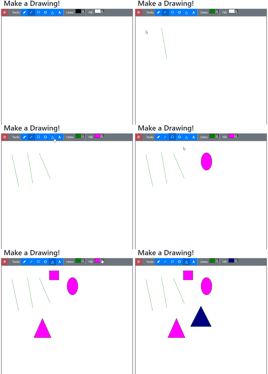
But wait, we're not done yet! Now let's see how to change the line styles and width.
Line Styles
Our requirements for this project specified that we needed a way to change the line "style" of the shapes. That is, we needed to allow the user to draw dotted, dashed, or solid lines. So, let's build a component to do this!
In FabricJS, there is a class called BaseBrush, which represents the brush being used at any given time to draw objects. BaseBrush contains two properties we will need to use: strokeLineCap and strokeDashArray.
strokeLineCap sets the line ending of the line being drawn; in our case, we only use the value "round".
strokeDashArray sets the properties of the dashes being drawn as part of a line. This allows us to set the size of the dashes. Our requirements specify that we need both dotted and dashed lines, so we will use strokeDashArray to create each of these.
class LineTypeComponent {
    private selectedType: string;

    constructor(private readonly target: string,
                private readonly parent: DrawingEditor) {
        this.render();
    }

    render(): void {
        var opt = new ImageDropdownOptions();
        Object.assign(opt, {
            selectedStyle: ImageDropdownStyle.Copy,
            selectedIndex: 0,
            width: 50,
            optionsList:
                [
                    {
                        display: '<svg width="50px" height="10px" viewBox="0 0 50 10"><line x1="1" y1="1" x2="50" y2="1" stroke="black" stroke-width="3px" /></svg>',
                        value: 'solid',
                        text: 'Solid'
                    },
                    {
                        display: '<svg width="50px" height="10px" viewBox="0 0 50 10"><line x1="3" y1="1" x2="50" y2="1" stroke="black" stroke-linecap="round" stroke-width="3px" stroke-dasharray="1 6" /></svg>',
                        value: 'dotted',
                        text: 'Dotted'
                    },
                    {
                        display: '<svg width="50px" height="10px" viewBox="0 0 50 10"><line x1="3" y1="1" x2="50" y2="1" stroke="black" stroke-width="3px" stroke-dasharray="6 6" /></svg>',
                        value: 'dashed',
                        text: 'Dashed'
                    }
                ],
            handlers: {
                'change': (lineType: string) => {
                    this.selectedType = lineType;
                    this.update();
                }
            }
        });
        new ImageDropdown(this.target, opt);
    }

    update() {
        switch (this.selectedType) {
            case 'solid':
                delete this.parent.drawerOptions.strokeLineCap;
                delete this.parent.drawerOptions.strokeDashArray;
                break;
            case 'dotted':
                this.parent.drawerOptions.strokeLineCap = 'round';
                this.parent.drawerOptions.strokeDashArray
                  = [1, this.parent.drawerOptions.strokeWidth * 2];
                break;
            case 'dashed':
                delete this.parent.drawerOptions.strokeLineCap;
                this.parent.drawerOptions.strokeDashArray
                  = [this.parent.drawerOptions.strokeWidth * 2,
                     this.parent.drawerOptions.strokeWidth * 1.5];
                break;
        }
    }
}
The update() method will change the brush's properties whenever a new item is selected in the image dropdown.
This next part is probably pretty familiar by now: we need to modify DrawingEditor and the Razor Page markup and script:
class DrawingEditor {
    //...Properties and Constructor

    //...Other methods

    addComponent(target: string, component: string) {
        switch (component) {
            case 'line':
                this.components[component]
                  = [new LineDisplayComponent(target, this)];
                break;
            case 'rect':
                this.components[component]
                  = [new RectangleDisplayComponent(target, this)];
                break;
            case 'oval':
                this.components[component]
                  = [new OvalDisplayComponent(target, this)];
                break;
            case 'tria':
                this.components[component]
                  = [new TriangleDisplayComponent(target, this)];
                break;
            case 'text':
                this.components[component]
                  = [new TextDisplayComponent(target, this)];
                break;
            case 'polyline':
                this.components[component]
                  = [new PolylineDisplayComponent(target, this)];
                break;
            case 'delete':
                this.components[component]
                  = [new DeleteComponent(target, this)];
                break;
            case 'lineColorChooser':
                this.components[component] = [
                    new ColorChooserComponent(target, this, '#000000', {
                        'change': (newColor: string) => {
                            this.setLineColor(newColor);
                        }
                    })
                ];
                break;
            case 'fillColorChooser':
                this.components[component] = [
                    new ColorChooserComponent(target, this, '', {
                        'change': (newColor: string) => {
                            this.setFillColor(newColor);
                        }
                    })
                ];
                break;
            //New component
            case 'lineType':
                this.components[component]
                  = [new LineTypeComponent(target, this)];
                break;
        }
    }

    //...Other methods
}
<div class="row drawingToolbar bg-secondary text-light">
<!--Delete component-->
<!--Shapes toolbar-->
<div class="separator"></div>
<div class="btn-toolbar">
<!-- New line style component -->
<label class="col-form-label controlLabel d-inline">Style:</label>
<div id="lineTypeComponent"></div>
<div class="separator"></div>
<label class="col-form-label controlLabel d-inline">Lines:</label>
<div id="lineColorComponent"></div>
<div class="separator"></div>
<label class="col-form-label controlLabel ">Fill:</label>
<div id="fillColorComponent"></div>
</div>
</div>var editor;
$(function () {
//...Initialize canvas
//Create a list of available display components
const components = [
{ id: '#lineDisplayComponent', type: 'line' },
{ id: '#rectangleDisplayComponent', type: 'rect' },
{ id: '#ovalDisplayComponent', type: 'oval' },
{ id: '#triangleDisplayComponent', type: 'tria' },
{ id: '#textDisplayComponent', type: 'text' },
{ id: '#polylineDisplayComponent', type: 'polyline' },
{ id: '#deleteComponent', type: 'delete' },
{ id: 'fillColorComponent', type: 'fillColorChooser' },
{ id: 'lineColorComponent', type: 'lineColorChooser' },
//New component
{ id: 'lineTypeComponent', type: 'lineType' },
];
//Add the components to the DrawingEditor, which will render them.
editor.addComponents(components);
$('#lineDisplayComponent').click();
//...Events and other methods
});GIF Time 2!
Guess what? It's GIF time again! Let's see how the new LineTypeComponent looks:
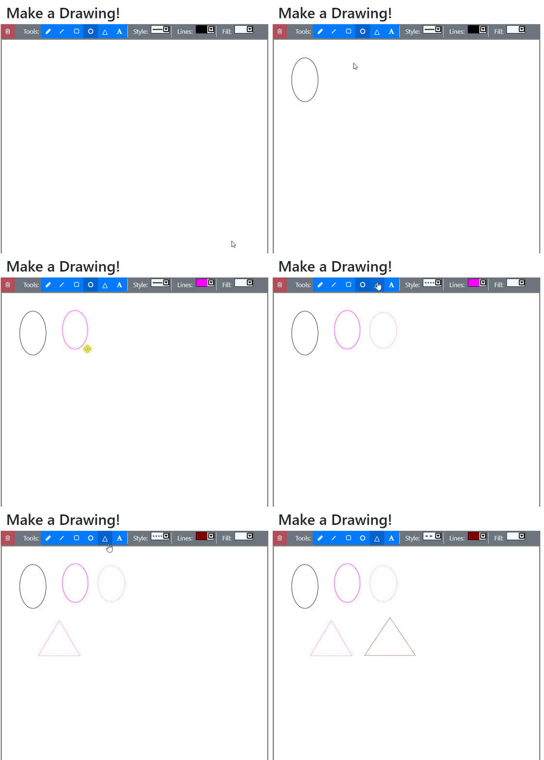
Woohoo! Almost there! There's only one thing left we need to do, and that's to create a component which allows the user to choose the thickness of the line being drawn.
Line Thickness
Given that you, dear reader, have probably seen this pattern many times by this point, I'm going to give you the short version of implementing this component. First, we need the new component class, LineThicknessComponent:
class LineThicknessComponent {

    constructor(private readonly target: string, private readonly parent: DrawingEditor) {
        this.render();
    }

    render(): void {
        var opt = new ImageDropdownOptions();
        Object.assign(opt, {
            selectedStyle: ImageDropdownStyle.Copy,
            selectedIndex: 0,
            width: 50,
            optionsList:
                [
                    { display: '<svg width="50px" height="10px"><line x1="0" y1="1" x2="50" y2="1" stroke="black" stroke-width="1px" /></svg>', value: 1, text: '1px' },
                    { display: '<svg width="50px" height="10px"><line x1="0" y1="1" x2="50" y2="1" stroke="black" stroke-width="3px" /></svg>', value: 3, text: '3px' },
                    { display: '<svg width="50px" height="10px"><line x1="0" y1="1" x2="50" y2="1" stroke="black" stroke-width="5px" /></svg>', value: 5, text: '5px' },
                    { display: '<svg width="50px" height="10px"><line x1="0" y1="1" x2="50" y2="1" stroke="black" stroke-width="10px" /></svg>', value: 10, text: '10px' }
                ],
            handlers: {
                'change': (newWidth: number) => {
                    this.parent.setStrokeWidth(<number>newWidth);
                }
            }
        });
        new ImageDropdown(this.target, opt);
    }
}
We also need to modify DrawingEditor (note that there's a new method, setStrokeWidth():
class DrawingEditor {
    //...Properties and Constructor

    //...Other methods

    addComponent(target: string, component: string) {
        switch (component) {
            case 'line':
                this.components[component]
                  = [new LineDisplayComponent(target, this)];
                break;
            case 'rect':
                this.components[component]
                  = [new RectangleDisplayComponent(target, this)];
                break;
            case 'oval':
                this.components[component]
                  = [new OvalDisplayComponent(target, this)];
                break;
            case 'tria':
                this.components[component]
                  = [new TriangleDisplayComponent(target, this)];
                break;
            case 'text':
                this.components[component]
                  = [new TextDisplayComponent(target, this)];
                break;
            case 'polyline':
                this.components[component]
                  = [new PolylineDisplayComponent(target, this)];
                break;
            case 'delete':
                this.components[component]
                  = [new DeleteComponent(target, this)];
                break;
            case 'lineColorChooser':
                this.components[component] = [
                    new ColorChooserComponent(target, this, '#000000', {
                        'change': (newColor: string) => {
                            this.setLineColor(newColor);
                        }
                    })
                ];
                break;
            case 'fillColorChooser':
                this.components[component] = [
                    new ColorChooserComponent(target, this, '', {
                        'change': (newColor: string) => {
                            this.setFillColor(newColor);
                        }
                    })
                ];
                break;
            case 'lineType':
                this.components[component]
                  = [new LineTypeComponent(target, this)];
                break;
            //New component
            case 'lineThickness':
                this.components[component]
                  = [new LineThicknessComponent(target, this)];
                break;
        }
    }

    //...Other methods

    setStrokeWidth(strokeWidth: number): void {
        this.drawerOptions.strokeWidth = strokeWidth;
    }
}
Finally, we need to modify the markup and script:
<div class="row drawingToolbar bg-secondary text-light">
    <!--Delete component-->
    <!--Shapes toolbar-->
    <div class="separator"></div>
    <div class="btn-toolbar">
        <!--New component-->
        <label class="col-form-label controlLabel d-inline">Size:</label>
        <div id="lineThicknessComponent"></div>

        <div class="separator"></div>

        <label class="col-form-label controlLabel d-inline">Style:</label>
        <div id="lineTypeComponent"></div>

        <div class="separator"></div>

        <label class="col-form-label controlLabel d-inline">Lines:</label>
        <div id="lineColorComponent"></div>

        <div class="separator"></div>

        <label class="col-form-label controlLabel ">Fill:</label>
        <div id="fillColorComponent"></div>
    </div>
</div>
var editor;
$(function () {
//...Initialize canvas
//Create a list of available display components
const components = [
{ id: '#lineDisplayComponent', type: 'line' },
{ id: '#rectangleDisplayComponent', type: 'rect' },
{ id: '#ovalDisplayComponent', type: 'oval' },
{ id: '#triangleDisplayComponent', type: 'tria' },
{ id: '#textDisplayComponent', type: 'text' },
{ id: '#polylineDisplayComponent', type: 'polyline' },
{ id: '#deleteComponent', type: 'delete' },
{ id: 'fillColorComponent', type: 'fillColorChooser' },
{ id: 'lineColorComponent', type: 'lineColorChooser' },
{ id: 'lineTypeComponent', type: 'lineType' },
{ id: 'lineThicknessComponent', type: 'lineThickness' },
];
//Add the components to the DrawingEditor, which will render them.
editor.addComponents(components);
$('#lineDisplayComponent').click();
//...Click events and methods
});GIF Time 3!
Once again, it is GIF time! Let's see how the new Line Thickness selector works:
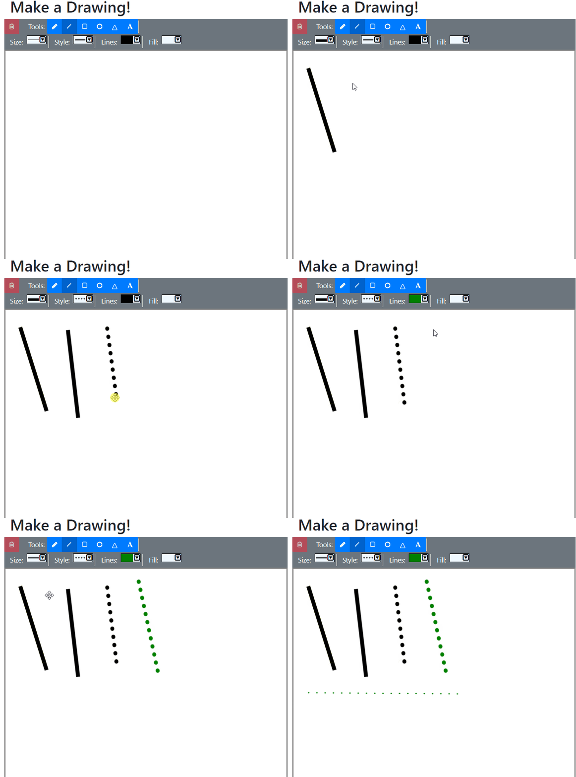
We are done! Now we can change line thickness, line style, line color, and fill color in our drawings!
Summary
In order to implement the line styles, thickness, color, and fills, we had to do the following:
- Create a base
ImageDropdownclass and related classes - Use the base
ImageDropdownto create selectors for line color and fill color. - Use the base
ImageDropdownto create selector for line thickness and style.
Don't forget to check out the sample project over on GitHub!
In the next part of the series, we're going to implement undo/redo functionality, including creating a state manager to keep the changes made to the drawing canvas in memory. Check it out!

Happy Drawing!


