Now that we have a canvas and can draw straight lines, let's find out how to draw other basic shapes, as well as create a "toolbar" for the user so they can pick what kinds of shapes to draw.

The Sample Project
The sample project for this series is over on GitHub, and contains the complete codebase for the finished drawing canvas.
Initializing the Display Components
Before we can build more shape drawers, we first need a way to display the existing drawers in a "toolbar" so the user can select which one they want. We need a lot of pieces to make this work, so let's get started building them.
The first thing we need is a class that represents each displayed option. We are calling these classes "display components" and we need a base one from which all specific components can inherit. This class will need some properties that allow us to set up things like the CSS classes and icon displayed, as well as set the Drawing Mode.
Here's the annotated code for this base class, called DisplayComponent:
class DisplayComponent {
    drawingMode: DrawingMode; //Line, Rectangle, Oval, etc.
    target: string; //The selector for the HTML element
                    //this Component will be rendered in
    hoverText: string; //The tooltip text
    svg: string; //The SVG for the component's icon
    cssClass: string; //CSS class for the FontAwesome
                      //icon used by this display component
    childName: string; //Selector for the child element;
                       //only used by text components.
    canvasDrawer: DrawingEditor;

    constructor(mode: DrawingMode, selector: string, parent: DrawingEditor, options: DisplayComponentOptions) {
        this.drawingMode = mode;
        this.target = selector;
        this.cssClass = options.classNames;
        this.hoverText = options.altText;
        this.svg = options.svg;
        this.childName = options.childName;
        this.canvasDrawer = parent;
        this.render();
        this.attachEvents();
    }

    //This method replaces the target HTML with the component's HTML.
    //The radio button is included to have Bootstrap use the correct styles.
    render() {
        const html = `<label id="${this.target.replace('#', '')}" class="btn btn-primary text-light " title="${this.hoverText}">
                        <input type="radio" name="options" autocomplete="off">
                        ${this.iconStr()}
                     </label>`;

        $(this.target).replaceWith(html);
    }

    private iconStr(): string {
        if (this.cssClass != null) {
            return `<i class="${this.cssClass}"></i>`;
        }
        else {
            return this.svg;
        }
    }

    //This method attaches the componentSelected event in DrawingEditor
    attachEvents() {
        const data = {
            mode: this.drawingMode,
            container: this.canvasDrawer,
            target: this.target
        };

        //When clicking the <label>, fire this event.
        $(this.target).click(data, function () {
            data.container.drawingMode = data.mode;
            data.container.componentSelected(data.target);
        });
    }

    selectedChanged(componentName: string) { }
}

class DisplayComponentOptions {
    altText: string;
    svg?: string;
    classNames?: string;
    childName?: string;
}
Because the icon's SVG format and the tooltip text are different per component, we extract them into the class DisplayComponentOptions.
We've already created the ability to draw straight lines in our previous post, so now we need a display component that the user can click on to draw a straight line.
First, let's extend the DisplayComponent class to create LineDisplayComponent:
class LineDisplayComponent extends DisplayComponent {
    constructor(target: string, parent: DrawingEditor) {
        const options = new DisplayComponentOptions();
        Object.assign(options, {
            altText: 'Line',
            svg: `<svg width="13px" height="15px" viewBox="2 0 13 17">
                    <line x1="0" y1="13" x2="13" y2="0" stroke="white" stroke-width="2px" />
                  </svg>`
        });
        super(DrawingMode.Line, target, parent, options);
    }
}
This class implements an SVG definition for the component's icon, and saves the alt text, before using super() to call the parent class DisplayComponent's constructor.
Showing the Display Components
We're halfway to being able to, ahem, display the display components. Now we need to make some changes to the main DrawingEditor class.
We want our DrawingEditor (which, as a reminder, represents the drawing area as a whole, including our display components) to be able to initialize components at creation time. To do this, we're going to create two methods:
class DrawingEditor {
    //...Properties and Other Methods

    //Adds the list of components to this drawing area
    addComponents(componentList: [{ id: string, type: string }]) {
        componentList.forEach((item) => {
            this.addComponent(item.id, item.type);
        });
    }

    //Creates new classes for each included component
    addComponent(target: string, component: string) {
        switch (component) {
            case 'line':
                this.components[component] = [new LineComponent(target, this)];
                break;
        }
    }
}
We also need to know which component is selected. You may recall the following line in the code for DisplayComponent:
$(this.target).children().first().click(data, function () {
    //...
    data.container.componentSelected(data.target);
});
The method componentSelected() needs to be implemented on DrawingEditor. We do that like this:
class DrawingEditor {
    //...Properties and Methods

    componentSelected(componentName: string) {
        //Deselect any objects on the canvas that are selected
        this.canvas.discardActiveObject();

        //FOREACH component in the drawing editor...
        for (var key in this.components) {

            // IF this component has a property with the passed-in name
            // THEN do nothing
            if (!this.components.hasOwnProperty(key)) continue;

            //OTHERWISE...
            const obj = this.components[key];

            //IF the component with the passed-in name
            //IS the component we expect
            if (obj[0].target === componentName) {
                //SET the drawing mode to the drawing mode
                //needed by the component
                this.drawingMode = obj[0].drawingMode;
            }

            //IF the method selectedChanged is defined on the component,
            //THEN call that method
            if (obj[0].selectedChanged !== undefined) {
                obj[0].selectedChanged(componentName);
            }
        }
    }
}
HTML and Script
We have one last piece we need to do to set up our first display component: we need to insert some HTML and some JavaScript on our Razor Page where we want to make a drawing.
<div class="row bg-secondary text-light">
    <div class="col-sm-11">
        <div class="row col-12">
            <div class="row drawingToolbar"> <!--Drawing toolbar-->
                <label class="col-form-label controlLabel">Tools:</label>
                <div class="d-inline-block">
                    <div class="btn-group btn-group-toggle" role="group" data-toggle="buttons" aria-label="Drawing Components">
                        <!--The LineDisplayComponent will go here -->
                        <div id="lineDisplayComponent"></div>
                    </div>
                </div>
            </div>
        </div>
    </div>
</div>

<div class="row editorContainer">
    <div class="CanvasContainer">
        <div id="canvas"></div>
    </div>
</div>

@section Scripts{
    <script src="~/lib/fabric.js/fabric.min.js"></script>
    <script src="~/js/drawingEditor.js" asp-append-version="true"></script>
    <script>
        $(function () {
            //...calculate canvas height and width

            var editor = new DrawingEditor('canvas',
                                           canvasHeight, canvasWidth);

            //Create a list of available display components
            const components = [
                { id: '#lineDisplayComponent', type: 'line' }
            ];

            //Add the components to the DrawingEditor, which will render them.
            editor.addComponents(components);

            //By default, select the LineDisplayComponent
            $('#lineDisplayComponent').click();
        });
    </script>
}
With all of this now written, we have a toolbar on our page that looks like this:
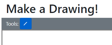
Which is great! But we don't have any other tools yet, so let's make some!
Rectangles
From this point on, for each drawing tool we need we must create both a "drawer" class (to draw the objects) and a "display component" class (to render the user-selectable control for that drawer).
Let's start adding basic shapes by first dealing with Rectangles. FabricJS provides us with a Rect class that represents this shape, so let's create a "drawer" class that can draw rectangles!
class RectangleDrawer implements IObjectDrawer {
    private origX: number;
    private origY: number;

    drawingMode: DrawingMode = DrawingMode.Rectangle;

    make(x: number, y: number,
         options: fabric.IObjectOptions,
         width?: number, height?: number)
            : Promise<fabric.Object> {
        this.origX = x;
        this.origY = y;

        return new Promise<fabric.Object>(resolve => {
            resolve(new fabric.Rect({
                left: x,
                top: y,
                width: width,
                height: height,
                fill: 'transparent',
                ...options
            }));
        });
    }

    resize(object: fabric.Rect, x: number, y: number): Promise<fabric.Object> {
        //Calculate size and orientation of resized rectangle
        object.set({
            originX: this.origX > x ? 'right' : 'left',
            originY: this.origY > y ? 'bottom' : 'top',
            width: Math.abs(this.origX - x),
            height: Math.abs(this.origY - y),
        }).setCoords();

        return new Promise<fabric.Object>(resolve => {
            resolve(object);
        });
    }
}In order to use this drawer, we need to include it in the list of drawers available.
class DrawingEditor {
    //... Properties

    constructor(private readonly selector: string,
        canvasHeight: number, canvasWidth: number) {
        //...
        this.drawers = [
            new LineDrawer(),
            new RectangleDrawer() //New drawer
        ];
        //...
    }

    //...Other methods

    addComponent(target: string, component: string) {
        switch (component) {
            case 'line':
                this.components[component] =
                	[new LineDisplayComponent(target, this)];
                break;
            case 'rect': //New component
                this.components[component] =
                	[new RectangleDisplayComponent(target, this)];
                break;
        }
    }

    //...
}
Now, let's include the display component. Here's our new RectangleDisplayComponent class:
class RectangleDisplayComponent extends DisplayComponent {
    constructor(target: string, parent: DrawingEditor) {
        const options = new DisplayComponentOptions();
        Object.assign(options, {
            altText: 'Rectangle',
            classNames: 'fa fa-square-o',
            childName: null
        });
        super(DrawingMode.Rectangle, target, parent, options);
    }
}
Note that this display component uses a FontAwesome icon as the display icon, not an SVG element (which is what the earlier line display component used).
Now, on the Razor Page, we need to add the HTML element where this display component will be placed, and instantiate the display component in the toolbar:
<div class="row bg-secondary text-light">
    <div class="col-sm-11">
        <div class="row col-12">
            <div class="row drawingToolbar">
                <label class="col-form-label controlLabel">Tools:</label>
                <div class="d-inline-block">
                    <div class="btn-group btn-group-toggle" role="group" data-toggle="buttons" aria-label="Drawing Components">
                        <div id="lineDisplayComponent"></div>
                        <!--New display component -->
                        <div id="rectangleDisplayComponent"></div>
                    </div>
                </div>
            </div>
        </div>
    </div>
</div>
@section Scripts{
//...Script includes
<script>
$(function () {
//...Instantiate drawing editor
//Create a list of available display components
const components = [
{ id: '#lineDisplayComponent', type: 'line' },
{ id: '#rectangleDisplayComponent', type: 'rect' }
];
//Add the components to the DrawingEditor, which will render them.
editor.addComponents(components);
$('#lineDisplayComponent').click();
});
</script>
}We now have a working rectangle tool, as shown in this GIF:
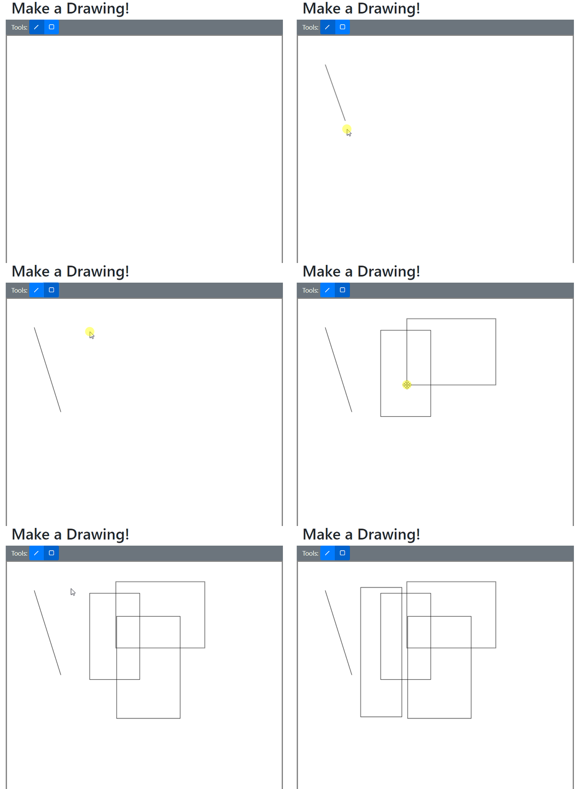
But we're not done yet! Let's build the tools for ovals!
Ovals
Here's the drawer for an oval, which uses the Fabric class Ellipse:
class OvalDrawer implements IObjectDrawer {
    private origX: number;
    private origY: number;

    drawingMode: DrawingMode = DrawingMode.Oval;

    make(x: number, y: number, options: fabric.IObjectOptions, rx?: number, ry?: number): Promise<fabric.Object> {
        this.origX = x;
        this.origY = y;

        return new Promise<fabric.Object>(resolve => {
            resolve(new fabric.Ellipse({
                left: x,
                top: y,
                rx: rx,
                ry: ry,
                fill: 'transparent',
                ...options
            }));
        });
    }

    resize(object: fabric.Ellipse, x: number, y: number): Promise<fabric.Object> {
        object.set({
            originX: this.origX > x ? 'right' : 'left',
            originY: this.origY > y ? 'bottom' : 'top',
            rx: Math.abs(x - object.left) / 2,
            ry: Math.abs(y - object.top) / 2
        }).setCoords();

        return new Promise<fabric.Object>(resolve => {
            resolve(object);
        });
    }
}
Now we need to create an OvalDisplayComponent class...
class OvalDisplayComponent extends DisplayComponent {
    constructor(target: string, parent: DrawingEditor) {
        const options = new DisplayComponentOptions();
        Object.assign(options, {
            altText: 'Oval',
            classNames: 'fa fa-circle-o',
            childName: null
        });
        super(DrawingMode.Oval, target, parent, options);
    }
}
With the drawer and display component created, we can update the DrawingEditor class to use them...
class DrawingEditor {
    //...Properties

    constructor(private readonly selector: string,
        canvasHeight: number, canvasWidth: number) {
        //...

        this.drawers = [
            new LineDrawer(),
            new RectangleDrawer(),
            new OvalDrawer()
        ];
        //...
    }

    //...Other methods

    addComponent(target: string, component: string) {
        switch (component) {
            case 'line':
                this.components[component] =
                    [new LineDisplayComponent(target, this)];
                break;
            case 'rect':
                this.components[component] =
                    [new RectangleDisplayComponent(target, this)];
                break;
            case 'oval':
                this.components[component] =
                    [new OvalDisplayComponent(target, this)];
                break;
        }
    }
...as well as updating the markup and script on the Razor Page:
<div class="row bg-secondary text-light">
    <div class="col-sm-11">
        <div class="row col-12">
            <div class="row drawingToolbar">
                <label class="col-form-label controlLabel">Tools:</label>
                <div class="d-inline-block">
                    <div class="btn-group btn-group-toggle" role="group" data-toggle="buttons" aria-label="Drawing Components">
                        <div id="lineDisplayComponent"></div>
                        <div id="rectangleDisplayComponent"></div>
                        <!-- New display component -->
                        <div id="ovalDisplayComponent"></div>
                    </div>
                </div>
            </div>
        </div>
    </div>
</div>
@section Scripts{
//...Script imports
<script>
$(function () {
//...Initialize drawing editor
//Create a list of available display components
const components = [
{ id: '#lineDisplayComponent', type: 'line' },
{ id: '#rectangleDisplayComponent', type: 'rect' },
{ id: '#ovalDisplayComponent', type: 'oval' } //New
];
//Add the components to the DrawingEditor, which will render them.
editor.addComponents(components);
$('#lineDisplayComponent').click();
});
</script>
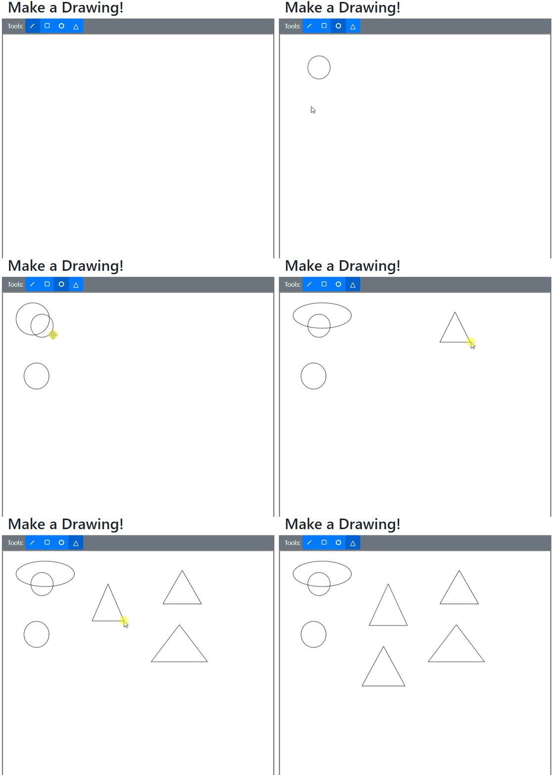
}We can now draw ovals! Triangles are up next.
Triangles
First, the drawer:
class TriangleDrawer implements IObjectDrawer {
    private origX: number;
    private origY: number;

    drawingMode: DrawingMode = DrawingMode.Triangle;

    make(x: number, y: number, options: fabric.IObjectOptions, width?: number, height?: number): Promise<fabric.Object> {
        this.origX = x;
        this.origY = y;

        return new Promise<fabric.Object>(resolve => {
            resolve(new fabric.Triangle({
                left: x,
                top: y,
                width: width,
                height: height,
                fill: 'transparent',
                ...options
            }));
        });
    }

    resize(object: fabric.Triangle, x: number, y: number): Promise<fabric.Object> {
        object.set({
            originX: this.origX > x ? 'right' : 'left',
            originY: this.origY > y ? 'bottom' : 'top',
            width: Math.abs(this.origX - x),
            height: Math.abs(this.origY - y),
        }).setCoords();

        return new Promise<fabric.Object>(resolve => {
            resolve(object);
        });
    }
}
Note that the drawer for triangles is remarkably similar to the earlier RectangleDrawer class.
Let's now build the TriangleDisplayComponent class:
class TriangleDisplayComponent extends DisplayComponent {
    constructor(target: string, parent: DrawingEditor) {
        const options = new DisplayComponentOptions();
        Object.assign(options, {
            altText: 'Triangle',
            svg: `<svg width="13px" height="15px" viewBox="0 0 20 20">
                    <line x1="0" y1="20" x2="10" y2="0"
                    stroke="white" stroke-width="2px" />
                    <line x1="10" y1="0" x2="20" y2="20"
                    stroke="white" stroke-width="2px" />
                    <line x1="0" y1="20" x2="20" y2="20"
                    stroke="white" stroke-width="2px" />
                  </svg>`,
        });
        super(DrawingMode.Triangle, target, parent, options);
    }
}
We can now update DrawingEditor:
class DrawingEditor {
    //...Properties

    constructor(private readonly selector: string,
        //...

        this.drawers = [
            new LineDrawer(),
            new RectangleDrawer(),
            new OvalDrawer(),
            new TriangleDrawer()
        ];
        //...
    }

    //...Other methods

    addComponent(target: string, component: string) {
        switch (component) {
            case 'line':
                this.components[component] =
                    [new LineDisplayComponent(target, this)];
                break;
            case 'rect':
                this.components[component] =
                    [new RectangleDisplayComponent(target, this)];
                break;
            case 'oval':
                this.components[component] =
                    [new OvalDisplayComponent(target, this)];
                break;
            case 'tria':
                this.components[component] =
                    [new TriangleDisplayComponent(target, this)];
                break;
        }
    }
Finally, let's update the script and markup:
<div class="row bg-secondary text-light">
    <div class="col-sm-11">
        <div class="row col-12">
            <div class="row drawingToolbar">
                <label class="col-form-label controlLabel">Tools:</label>
                <div class="d-inline-block">
                    <div class="btn-group btn-group-toggle" role="group" data-toggle="buttons" aria-label="Drawing Components">
                        <div id="lineDisplayComponent"></div>
                        <div id="rectangleDisplayComponent"></div>
                        <div id="ovalDisplayComponent"></div>
                        <!--New display component -->
                        <div id="triangleDisplayComponent"></div>
                    </div>
                </div>
            </div>
        </div>
    </div>
</div>
@section Scripts{
//...Include scripts
<script>
$(function () {
//Initialize drawing editor
//Create a list of available display components
const components = [
{ id: '#lineDisplayComponent', type: 'line' },
{ id: '#rectangleDisplayComponent', type: 'rect' },
{ id: '#ovalDisplayComponent', type: 'oval' },
{ id: '#triangleDisplayComponent', type: 'tria' }
];
//Add the components to the DrawingEditor, which will render them.
editor.addComponents(components);
$('#lineDisplayComponent').click();
});
</script>
}Now we can draw both triangles and ovals, just like in this GIF:
With that, we've completed the basic shapes portion of this series!
Summary
In order to draw basic shapes on our FabricJS canvas, we needed to do the following:
- Create a base class for all "display components" e.g. items on the toolbar.
- Modify the DrawingEditor class to display a list of display components.
- Modify the HTML markup to place the display components at the correct location.
- Modify the script on the page to create and submit a list of known-valid components.
- Create new child display component classes for lines, rectangles, ovals, and triangles.
Don't forget to check out the sample project over on GitHub! It contains the completed drawing control with all features implemented.
Next up in this series, we'll make a new component that will allow us to delete objects from the canvas, and implement hotkey functionality for the same. Check out Part 3 of Drawing with FabricJS and TypeScript!

Happy Drawing!


